The Big Kong Shopify Theme
$5Bold comic-culture Shopify theme for streetwear drop brands. Raw typography, crimson accents, full-bleed illustrated heroes.
Overview
This theme is built for brands that don't play it safe. Inspired by the visual language of underground comic culture, music merchandise, and limited-edition streetwear drops, it puts attitude before convention and artwork before everything else.
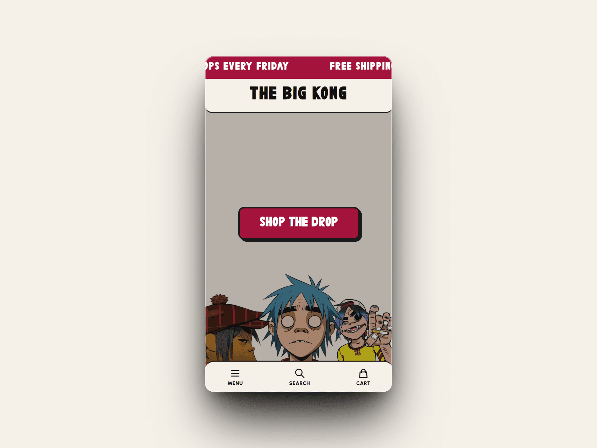
The layout opens with a scrolling announcement bar in deep crimson — urgent, persistent, impossible to ignore. The navbar keeps it stripped back: a hamburger menu on the left, your brand name centered in a heavy slab-serif that commands the page, and utility icons on the right. No clutter. No distractions. Just brand.
The hero section is where this theme lives. It's designed as a full-bleed canvas for illustrated or artistic imagery — characters, artwork, campaign visuals — anchored to the right side of the viewport so your image bleeds naturally into the layout. The left side stays open for a single, focused call to action. One button. One message. The kind of hero that doesn't explain itself.
A marquee trust bar at the bottom of the hero keeps scrolling — sustainable fabrics, made in London, limited edition — the kind of social proof that feels like culture instead of marketing copy.
Typography throughout uses a chunky, irregular display font that carries the handmade energy of print culture and zine aesthetics. Every heading feels like it was stamped, not typed. The color system is minimal by design — an off-white or warm cream base, near-black text, and a single dominant accent color (crimson here, fully customizable) used surgically on bars, buttons, and borders.
This theme suits brands dropping weekly, selling in limited quantities, and building a community around the product — not just the product itself. It's fast to navigate, built for mobile-first browsing, and structured so your visuals carry the weight while the UI stays completely out of the way.
What's Included
What's Included
- Announcement Bar — Scrolling marquee with customizable text, background color, and link. Built for urgency. Ideal for drop countdowns, shipping thresholds, and weekly release alerts.
- Header — Minimal three-column navbar with hamburger menu left, centered brand logo in display typography, and search + cart icons right. Sticky on scroll.
- Hero Section — Full-viewport illustrated hero with right-anchored image canvas and left-aligned CTA block. Single headline, single button. Designed to showcase character art, campaign imagery, or editorial photography without cropping or constraints.
- CTA Button — Chunky bordered button with dark outline offset shadow. Fully customizable label, link, and color.
- Trust Marquee Bar — Auto-scrolling bottom bar with dot-separated text items. Use for brand values, shipping info, certifications, or drop cadence messaging.
- Collection Pages — Grid layout optimized for drop-style releases with quick add, sold out states, and limited edition badging.
- Product Pages — Clean editorial layout with large imagery, variant selectors, and add to cart. Typography-forward, no visual noise.
- Cart Drawer — Slide-in cart with upsell slot and checkout button. No separate cart page needed.
- Mobile Optimized — Every section built mobile-first. Hamburger nav, touch-friendly tap targets, full-bleed imagery on small screens.
- Theme Editor Ready — All sections, colors, fonts, and text fully editable inside the Shopify Theme Editor. No code required.
- Drop-Culture Typography System — Pre-configured display font pairing with heavy slab-serif headings and clean body type. Swap fonts from the editor.
- Color System — Single accent color applied globally across bars, buttons, and borders. Change the entire mood of the site in one click.